FINANGERAPPUI DESIGN
Read CaseStudyBack
Finanger UI System
Project summary + metrics
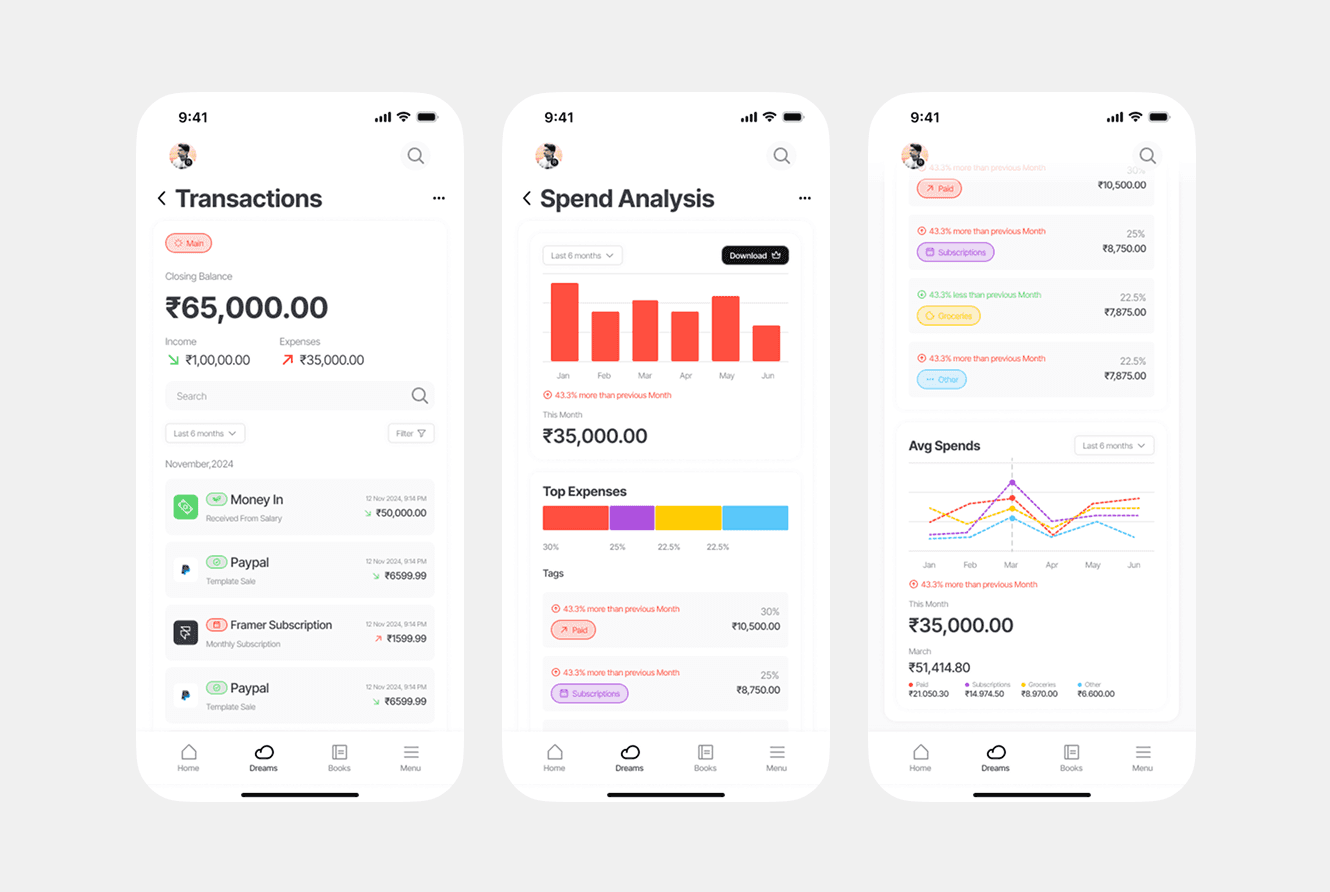
Extended Finanger into a fuller product surface covering transactions, spend analysis, and trend views across three key mobile flows.
What was the problem?
Users needed more than a balance snapshot. They needed trustworthy history and category insight without losing the product's calm tone.
Project goal
Ship a connected set of screens that explain money movement with charts, filters, and scannable lists.
My approach
Designed companion screens around search, date filters, category breakdowns, and average spend visuals with a consistent component language.
Key impact & outcomes
Created a presentation-ready UI kit that communicates product depth for stakeholder reviews and development planning.